Viasat’s Interactive Wall
Viasat is a San Diego-founded global communication company who interact with network and seek to power high-quality, secure, affordable, fast connections to their customers. I teamed with another designer to help Viasat make a shift towards becoming a more design-driven company by creating an interactive, digital experience that helped communicate various design definitions, principles and processes to non-designers at Viasat. Not only would communicating these design concepts help non-designers understand why the company was making this shift, it also allowed easier integration of customer experience processes to flow, making communication between designer, product manager and engineer teams more seamless.
Project Outline
Tools Used
Figma
Miro
Google Drive/Google Doc
Google Slides
My Role
Handled and deciphered primary and secondary research to properly brainstorm and ideate for the company values and principles.
Curated our design methodology and aided to produce user research, iterative mock-ups and prototypes. Curated and created written design principles, concepts, definitions and methodologies for deliverables.
Team Member
Lucy Guo
Time Duration
3 months
Deliverables
A fleshed out prototype featuring our interactive digital wall
Complying user research such as a storyboard, empathy map, personas, etc.
a style guide with guiding brand assets
A PRD and presentation deck
Takeaways
Expanded on my skills in UX research, design thinking and technical skills on applications such as Figma and Miro
Manage time management when collaborating with different teams in Marketing, Engineering and Design.
CXRD Approach: The Double Diamond
Our process included following the Double Diamond Design which include:
Research
Synthesis
Ideation
Implementation
We also incorporated design principles that the UX team at Viasat engaged in such as feedback from Interviews, Empathy Maps, Personas, Storyboards. With including multiple iterations with each step, we were able to identify pain points within different aspects of our design to ensure we were able to deliver a seamless and engaged high fidelity deliverable to the Design Team at Viasat.
Planning and Organizing our Problem Space
My partner and I were given deliverables from the Viasat design team which included a design guidebook, a problem scope and interview transcripts from employees to examine. From there, we were able to understand and digest Viasat’s approach to their design methodology.
Our Problem
Synthesis: Inspiration and Mapping
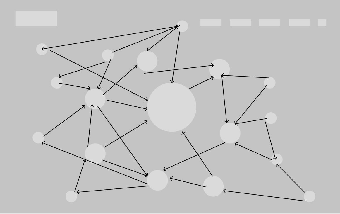
I was inspired by this image of a satellite network as the basis of my exploration of design with Viasat. Each node holds informations, and that information is divided hierarchically by size which signifies importance. Each informational node is connected by another, and they all are interconnected in some way. Similarly, design has basic concepts, definitions, and strategies that are used more than others. Each design concept can stem and build off each other, and they are all interconnected within the design process. I kept this in mind when trying to brainstorm different ways to portray design.
Intent of the Interactive Wall
Purpose
Keep our users interested at the topic at hand - the problem isn’t just how to get design information to people who do not have design knowledge, but to successfully engage with the users to keep them interested on the topic so they are able to use design in their everyday practice
Interactivity- It lets users speak, navigate through content using informational nodes, combining familiar principles of Customer Experience and new knowledge of design principles, research, strategies and CX.
Features
Sort design concepts hierarchically through the outline of informational nodes in order to encourage user interaction
Walkthrough of topics, exercises and discussion of themed design subjects
Illustrations of design processes to bring more visual understanding such as graphics, tables, activity books, etc
Ideate: Storyboards, Empathy Maps, User Personas
Viasat Empathy Map
Given data from previous employees of Viasat, we were able to create an Empathy Map, which gives insight to the thoughts, feelings and desires of non-designer employees in order for us to empathize and get perspective of what they have seen, heard and said about what they think about the shift for their company to become more design-driven.
Viasat User Personas
My partner and I created three user personas to help us understand our different target audiences from different fields affected by the problem space. The personas include the perspectives of a Software Developer, a Frontend Developer and Customer Experience Researcher and Designer whose roles, goals and frustrations are highlighted so we could get a better understanding of the scope of the problems of the users that we are dealing with.
Viasat Storyboard
The Viasat storyboard was designed to show an example of how Viasat employees could incorporate the Interactive wall with their workspace. It follows Jim, an engineer in Viasat who is unsure about some design aspects of a task he was assigned from his team’s project. A simple search in the Viasat interactive wall, and he was able to answer his design inquiries for his project assignment. The wall is able to complete it’s purpose of being an engaging, interactive and memorable way to inform non-designers about design principles, definitions and processes.
Detailed Design: Our Wireframe Process
Our Style Guide
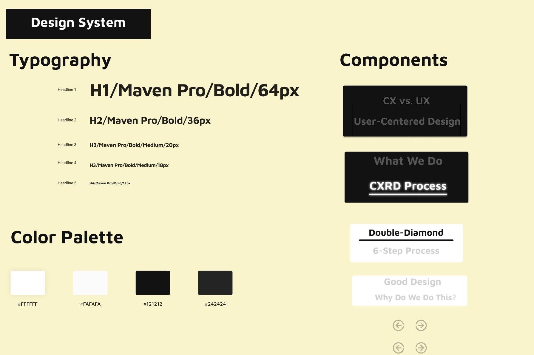
We decided to follow a more monochromatic and clean look to the Interactive Wall by sticking with a black and white color palette. In order to channel a more ‘satellite’-type feel to it, we added more solid lines and rounded edges to our components with utilitarian typography.
The Information Hierarchy
Taking reference from the Viasat Design Guidebook provided, I was able to sort through it to categorize core design principles that mattered to our problem scope in order to prioritize Viasat’s core design values. This Information Hierarchy serves as an outline for how our clickthrough prototype.
Mapping out our Outline
Our Wireframe
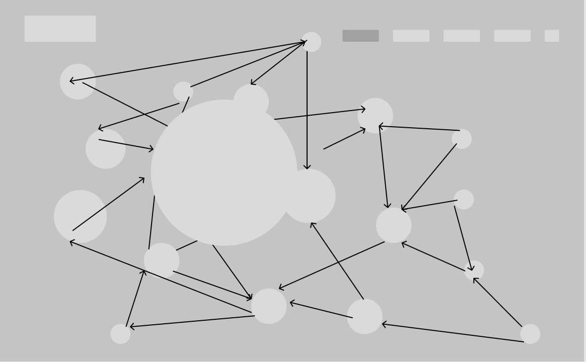
We started our wireframe on Figma and started iterating our satellite outline. When the user would click on one of the circles, the bubble would expand out and from there we would include principles and definitions from our guidebook.
—————>
Our iterations included:
Adding a search bar and minimal functions to optimize user focus and streamline attention to the Wall.
Combining use of graphics and illustrations to convey our message.
Collaboration with key stakeholders to emphasize common understanding and branding techniques.
Using prior user research to guide design decisions on branding and overall user experience.
——————————>
Final Delivery and Build: Viasat Interactive Wall
Overall, working on this project aided in my growth in elevating visual identity branding, utilizing user flows, interactions & high-fi prototypes and collaborating with other multifaceted teams in engineering and marketing. Based off of my inspiration of satellite mapping architecture, we were able to create a extensive, start-to-finish interactive digital wall with user research, iterations, a style guide, PRD and presentation.


