License to Freedom
Design Intern & Copywriter 2019-2021
License to Freedom (LTF) is a non-profit organization dedicated in aiding refugee and immigrant survivors of domestic and relationship abuse within the San Diego region.
At the time, with Covid-19 having much of the general public quarantined, my supervisor reported that there has been a very rapid number of restraining order and domestic abuse cases rising since quarantine that has kept her and her staff very busy. They do not have the time to comb through foundation grants. I decided to redesign License to Freedom’s website in order to make the whole user experience process more intrinsic for those visiting the site. The new website launched at the end of June, along with a social media and email campaign.
Link to the website here:
Project Outline
My Role
Producing wireframe prototypes to keep in steady communication with my supervisors on my work flow.
Using general accessibility principles to create brand appropriate and engaging written content that appeals to different audiences while maintaining consistency and efficacy of copy.
Creating a style guide to compliment with organization branding and crafted content to exhibit narrative experiences and factual information in English, Arabic, Farsi and Kurdish.
Used HTML and CSS for proper customizations and support and created graphics to enhance the website’s information hierarchy.
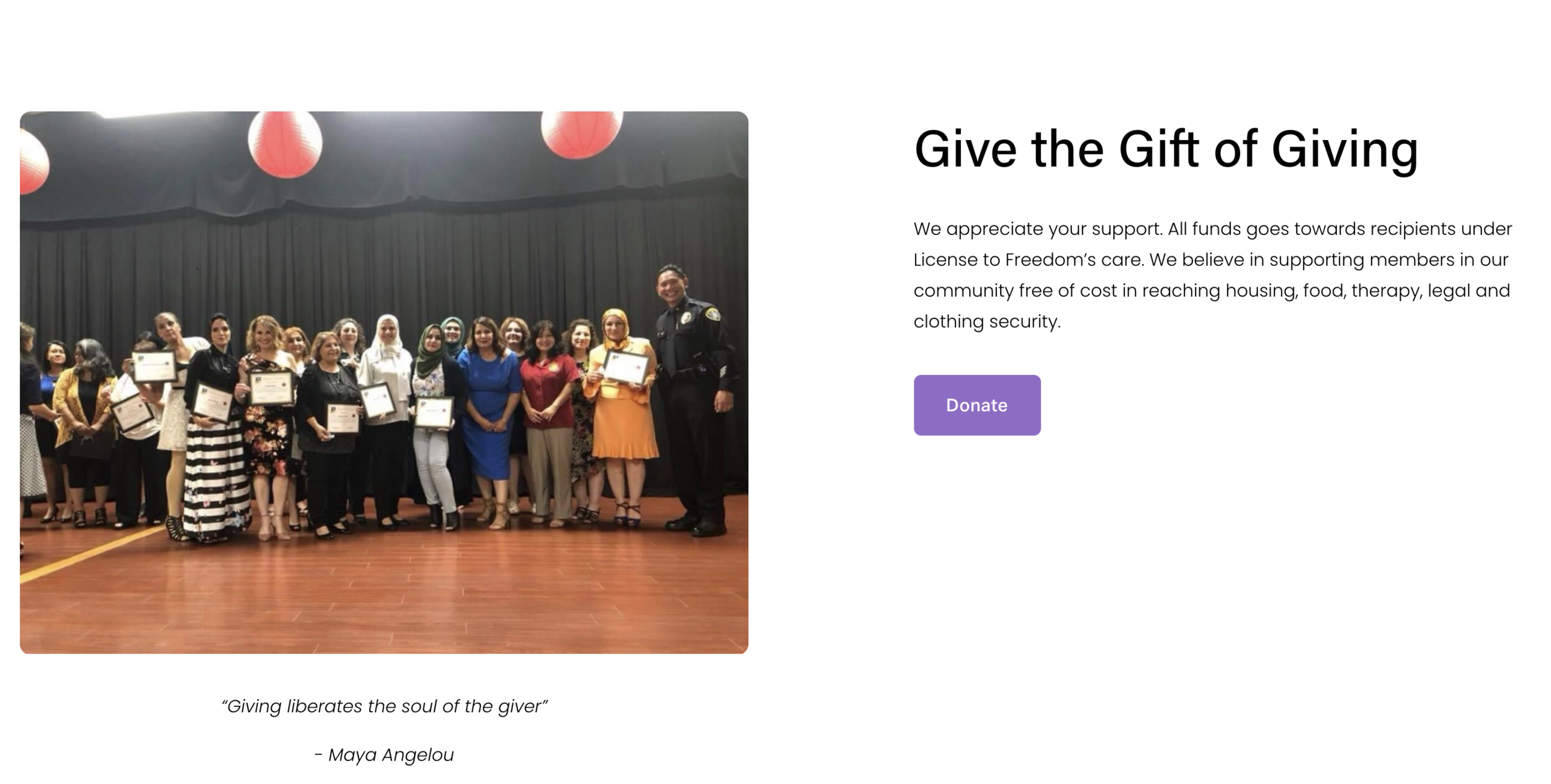
Researching and including a donation portal on the site which includes credit/debit, Venmo as well as Paypal to accrue funds.
Tools Used
Squarespace
Adobe Illustrator
Figma
Canva
Impact
The new website launched at the end of June. It generated 75% increase in traffic and 50% jump in donation to the non-profit.
Social media channels such as Instagram and Facebook jumped 20% in traffic as well.
Time Duration
6-8 months
The Old Website- Common Issues and Problem Space
Problem:
LTF promotes a community-based nonviolent approach to issues relating to sexual and domestic assault through community education, self-sufficiency, and advocacy for refugee and immigrant survivors through free legal/professional aid and services. I became introduced to License to Freedom through a university event and started interning in 2019. Working with the Executive Director Dilkhwaz Ahmed and dedicating my time interning at LTF makes it an organization very dear to my heart.
I noticed during my time at LTF that they rely mainly on grants coming from different foundations to get funded. I have helped them research and apply for these grants before, but they are a very long and tedious process filled with jargon which is inaccessible for those who use english as a second language. At the time, with Covid-19 having much of the general public quarantined, my supervisor reported that there has been a very rapid number of restraining order and domestic abuse cases rising since quarantine that has kept her and her staff very busy. They do not have the time to comb through foundation grants. In order to aid in potential clients and victims in getting proper, updated resources and accrue funds to keep up with their sudden influx of clients.
This is a general snapshot of the previous website. Already the interface of the website is very choppy- there is a lot of information with a small font that is shared onscreen that makes it hard to read followed by copious amounts of white space. There were some spelling and grammar mistakes, as many of the members of the organization speak English as their second language. There was a sort of randomness that came with the placing of the paragraphs of information on screen that made it hard for users to direct their attention on more important information from the nonprofit. I also noticed there was not as many visualizations of the events, resources and phenomena they would describe, making it harder to break down and easily digest the information shown on screen. Donation options were limited- there were no donation options other than Paypal when clicking the ‘Donate’ button.
In Conclusion-
1) There is a lack of digital presence. Upon this site, users are not able to access vital information intuitively which causes confusion and high on-site traffic for the organization.
2) There were not any flexible donation options to gather funds from various sources to help the organization.
Our Relationship with Empathy and Our Users
How do we build an ongoing relationship with empathy with our users through a digital platform? In what ways may we continue to build trust and understanding with the diverse range of issues our clients and LTF face so that they are able to effectively tackle them? What dimensions can LTF focus on in order to fully make sure our client needs are being met?
Transparency
Showing my design decisions and rough iterations to leaders so they can be kept in the loop and listening to feedback
Explaining the process- talking about the ‘why’
Accessibility
Making design participatory- that includes listening meaningfully to my clients and actively engaging them in the work
Gathering testimonials which can further help with future brainstorming and research
Knowledge
Collaborating with others and creating content that showcases vital information in a clear and concise way
Including accessible language to guide users into gaining more information about their resources and options
Inclusive Language and Experiences: Identifying content for our main user groups
Secondary Group: Philanthropists and Community Members
Primary Group: LTF’s Clients
Our secondary user group which LTF aims to attract is philanthropists and community members who want to help our organization financially. LTF relies on mostly on grants and donations to keep its organization running, so appealing to our secondary user group is crucial. In Brand Bible by Debbie Millburn, Jennifer Kinon & Bobby C. Martin discuss the essentials in branding a non-profit- and a main aspect to that was research the elements that made a non-profit a non-profit and using the elements that makes License to Freedom, to add in different aspects of the site. Keeping this in mind and taking inspiration from Brand Bible, I ran a competitive analysis on other San Diego non-profits in the area. I identified that they all have 1) visual representations of love for their work 2) noticeable signals to donate on various sections of their site and 3) more active words and verbs in their paragraphs to indicate more vigor and credibility in their work ethic.
From there, I made changes to include many pictures of team members to humanize the organization (especially on the front page), strategically add donation buttons under aid and program description copy and include more diverse active verbs but still managed to keep it simple.
When I first began to think about our problem space, it was clear that LTF’s clients who will access the site to seek DV resources and want to know more about our legal and therapy services would be our primary user group. Since our clients are fresh immigrants and refugees and are mostly ESL-oriented, I conducted interviews with our activists at LTF and pinpointed 3 main languages that our clients speak which is Kurdish, Farsi and Arabic.
From there, I was able to work with LTF’s language specialists to properly write and express a short and clear message on what the information they accessed contains and next steps. Covid resources were also included to inform the community. When writing the English on the site, I had to keep in mind that those accessing the information might not understand all of the words, so the content written was shaped to be as clear and succinct as possible to maintain transparency and accessibility.
License to Freedom’s Style Guide and Brand Assets
By pinpointing LTF’s goals for their main takeaways as a kind, professional organization that strives to give purposeful support in an open-minded way to their community, I was able to start forming their style guide.
Color Palette
Purple represents domestic violence awareness, so it was imperative that it would be used to represent the organization. The previous website also had cream accents as a secondary color, which was something our director wanted to keep. I added the cream #FFF9DD, which was a little lighter than its older counterpart in order to keep the focus on our purple primary color. Our tertiary color is used in the form of black/light black to break up the purple and white sections. Mainly I wanted to use it to draw attention to heavy-hitter topics.
Typography
I decided to use Acumin Pro Medium as the heading font. It’s linear and thicker lettering gives it a more straight-forward and simple feel which makes it easy to read and perfect for those to read information quickly. Poppins Regular naturally spaces out its letters a little bit more widely with its round shape. But, it also carries the same straight lettering consistency, which makes easier for those who take the time to read our paragraphs. Changing the button’s font to Aktiv Grotesk Regular provides some change stylistically with a slight arched and skinny look in the pops of buttons sprinkled throughout the site & breaks up the more circular feel of Poppins.
Buttons and Assets
The Dove is an iconic symbol for LTF representing overcoming hardship and having the choice of freedom with her white silhouette and wide, open wings. I redid the silhouette of the Dove on Adobe Illustrator to make the design look like a smoother and cleaner icon, especially since it greets the users in the front landing page. Though I customized the buttons with CSS to change their squoval shape to a more rounder one when hovering over it, I both made the purple and white buttons on the site to accentuate the organization’s brand.
Created on Adobe Illustrator.
Brand Direction: Do’s and Don’t
When discussing the overall ‘feel’ of the organization, the executive director wanted a ‘professional, but welcoming’ experience to those who visit the site. We strategized a voice and tone guideline to help with the construction of our user journey to help maintain consistency and define our goals. Our guideline outlines characteristics which prompt clear, sincere and humble language that promote awareness, humility and credibility. Our goal with this guideline is to consistently show our users that LTF is a community first organization ready to advocate for those brave and willing to reach out for help.
LTF’s Website Information Architecture
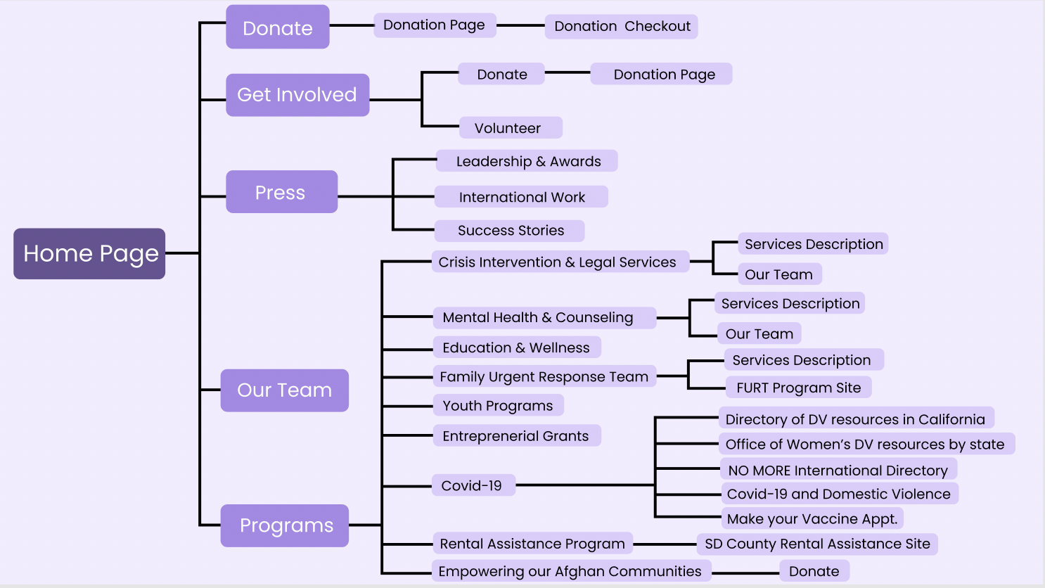
I created this information architecture graph in order to group the layout of LTF’s programs and resources together in a way that is intuitive to our 2 main user groups. The main purpose of the website is to let users know about programs and place faces to our community leaders names. This is to lead users to the instant knowledge they are seeking within our programs/resources and establish credibility of our organization. This is to build trust between our users.
Through competitive analysis, I placed the ‘Donate’ at the right end of the page grouped with the ‘Get Involved’ page while i grouped ‘Programs’ and ‘Our Team’ together. When creating the buttons, I titled them using the title of the resource articles to increase cognitive offload when accessing information fast.
Customizations and Tweaks
Button Hover Response
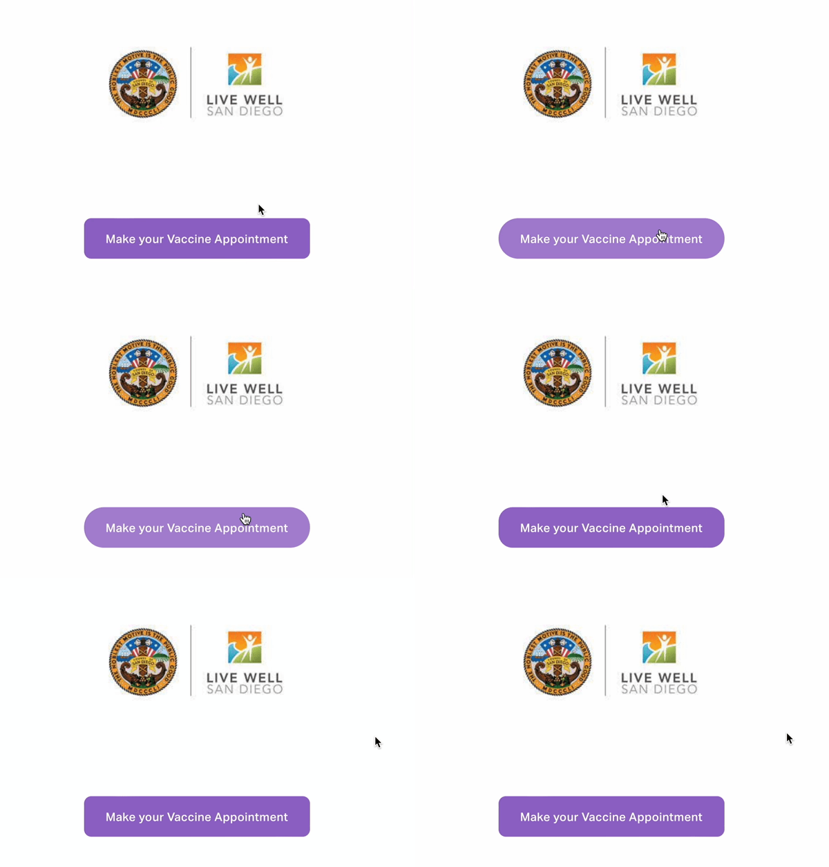
Using CSS, I was able to program a feedback response when a user hovers over a button. The button, in a purple, square shape, shifts to a circular one. By giving visual feedback, I prompt the user to click the button containing information essential to the organization. Users are able to quickly know that this button can perform the action it is indicating.
Highlighting
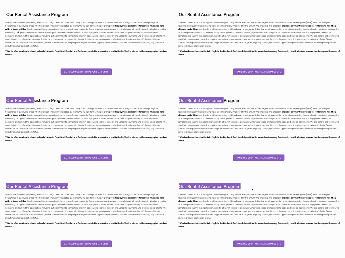
Using CSS, I changed the highlight option to the organization’s brand color. It is a small tweak, but it is a cohesive element that is able to enhance LTF’s brand. Since purple is the color for domestic violence awareness, integrating it within the site in these small ways bring visual reminders to LTF’s vision and mission.
Menu Hover & Rounded Corners
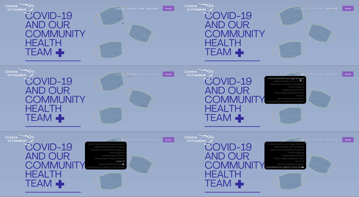
Using CSS, the menu options and dashboard options are able to be highlighted when hovered over in order to present clarity in where the user is clicking. As shown on the left, I made the drop down menu have rounded corners as well as all pictures and videos to give the site a more user friendly feel.
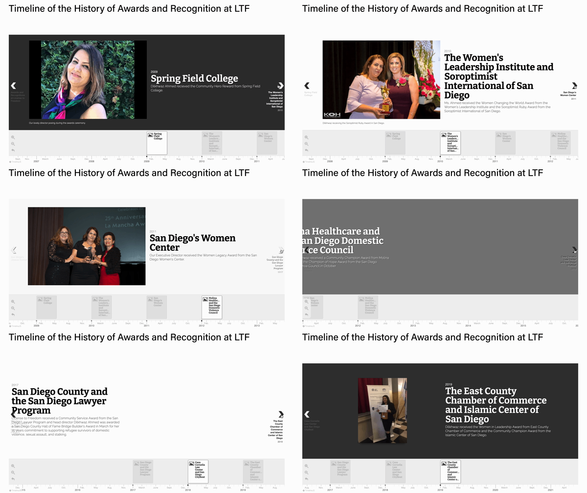
Awards and Recognition Timeline
With code, I created a timeline to showcase the achievements LTF has garnered over the years. I chose a timeline to break up the text on the screen and create a visual element which can be more engaging to our audience who are interested to know about the organization and it’s credibility.
Examples of Page Work and Writing Samples
Here is some samples and microcopies of some of pages I have redone for my organization. When I mean redone, that includes visual work such as font, spacing, bolding, button/picture/video placement as well as writing. Through my research of the organization’s history, interviews from current members and collaboration with supervisors, I knew I had to create clear and accessible, but professional language to appeal to our refugee users, but also philanthropists that would like to donate to the organization. All descriptions below done by me.
Analytics and Results
License to Freedom’s viewer analytics during beginning launch in Late June 2021.
When launching the site in late June, it had received a 75% increase in viewers compared to LTF’s previous site analytics. I also assisted in launching an online campaign on their social media and email channels to aid in boosting donations and viewership. With more accessible payment methods available, such as Venmo, Paypal and credit/debit payment processors, LTF was able to see an almost 50% rise in donations. Since we needed funding to help support our Afghan Refugee support program, I was very happy to see the increase in activity on the site.
During my time at License to Freedom I was able to:
Coordinate with engineers, activists and my supervisor to aid in developing a more user-friendly site
Execute tasks such as calendaring, filing, scheduling/following up on meetings and adapting to different situations regarding interdisciplinary stakeholders
Use Adobe XD, Illustrator, Figma, Indesign to design the needs of the organization
Re-vamp LTF’s voice & tone guidelines, solidify their brand assets and strengthen their content by practicing UX Writing principles (such as user-centered copy creation, microcopy, competitive analysis, etc.)
Making design a participatory process and involving others to give and receive feedback on respective design tasks


